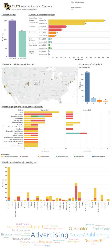
A visual representation of internship data from the spring and summer semesters of 2018 from the College of Media, Communication and Information. The infographics��show��how many students were interning during each semester, what those students were majoring in, where students were interning��and what industries were most popular amongst those students interning.��
click to view full-size PDF files
By: Kexin Zhai and Anastasiya Zhukova
Information Science
��
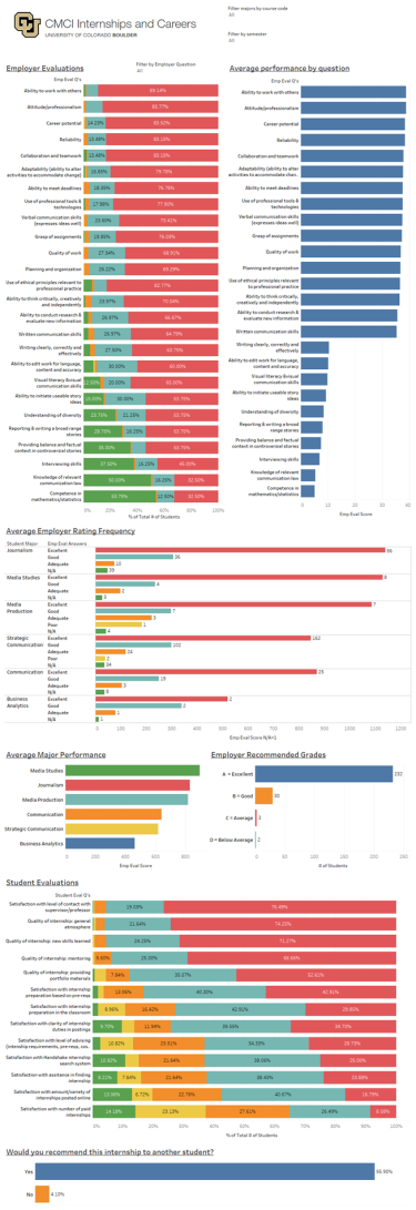
"With this project, my partner Anastasiya Zhukova and I set out to create a solution that would allow the CMCI Internship Coordinator, Christine Mahoney, to have a way of visually interpreting student internship data coming in from the Handshake platform for both the spring and summer semesters of 2018. Handshake houses the student internship report data along with the employer evaluations of student performance and the student evaluations of their internship experience, which makes 3 total datasets. Trying to interpret all of this data from an Excel spreadsheet can be exhausting and time-consuming, as that requires lots of filtering, sorting and jumping back and forth between different spreadsheets. Such a problem can be easily solved by creating visualizations of the aggregate part of the data.
These visualizations could be a great supplement to the faculty reports by enhancing comprehension with visuals. Considering that most of our data was qualitative, we largely used descriptive statistics to create most of the visualizations, specifically for the “Overview” dashboard which relied on data from the student reports to tell us how many students interned during each semester and from what majors, where students interned, what organizations students interned at, and which locations and industries were the most popular among our sample.
��2019 Showcase Selection

